A Colorful New Year
Published December 20, 2018
Every year for the last two decades the Pantone Color Institute has released a color for the upcoming year which influences product development across many industries such as fashion, home décor, graphic design and much more.1
As we are just a few days from the new year, we want to spend some time discussing the 2019 Pantone:
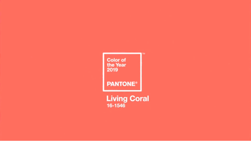
Living Coral 16-1546
Photo Credit: Pantone.com
This soft energizing coral hue is a cheerful color that you will see everywhere in 2019. The Pantone Color Institute says that this color symbolizes our need for optimism and joyful pursuits and embodies our desire for playful expression.1
In celebration of the 2019 color release, Pantone has released five different color palettes that include Living Coral. The main palette that they suggest as being the Focal Point of a room, are as follows:
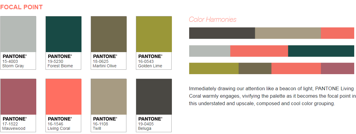
Photo Credit: Pantone.com
To see all the 2019 color palettes click the following link: https://www.pantone.com/color-intelligence/color-of-the-year/color-of-the-year-2019-palette-exploration
Stores like Ikea are already using Living Coral in their décor pieces and furniture.2


Photos Credit: Ikea.com
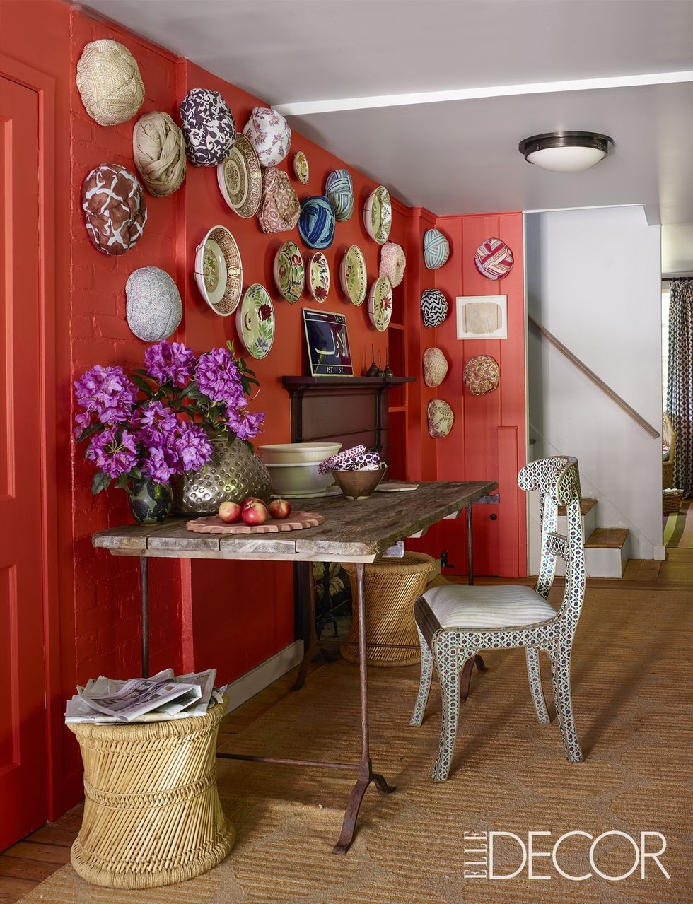
This color has gold undertones and is not as bright as a normal pink but softer than any red; it is a subtle combination of the three.3 We think that this color looks great with brighter blues, purples and greens as a good contrast. And with this combination, you definitely get a playful, yet relaxing vibe from the room, as seen in the first photo below. You may be thinking that this looks like nothing more than just a salmon color and you wouldn’t be wrong. Living Coral does reside in the “salmon” family and can span several different shades.
Photo Credit: Elle Decor
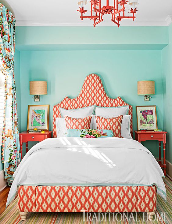
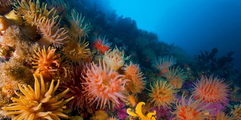
Use it with more subtle colors for an ocean feel. This color scheme is common among beach houses and cottages near the water. Which makes sense, considering this color is supposed to spark joy and playful expression. Where is a place where lots of people enjoy playing and relaxing? - the beach!
Photo credit: Traditional Home
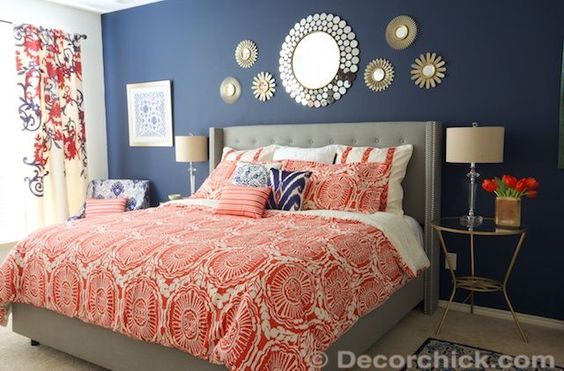
And one of our favorites is the coral and navy combination. This combination exudes an elegant atmosphere with a pop of coral color.
Photo credit: DecorChick.com
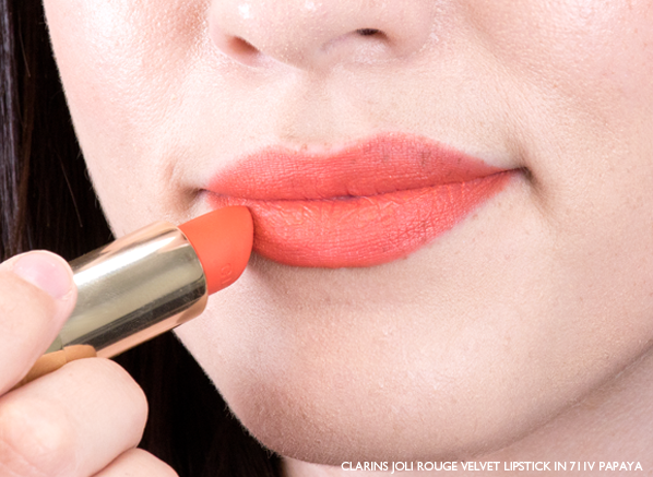
If you are looking to be in style this upcoming year you might even find this peachy color in your favorite makeup lines. Who knows you might actually have this color already in your collection. A coral lip color is best for summer as a soft, nude color on your lips with just a hint of peachy color.
Photo Credit: escentual.com
A huge place you will see this color in the new year will be in fashion. The fashion industry is one of the largest industry to benefit from the new Pantone each year, because brands can specifically design their product to match the style and color for that year.


Photo Credit: Teen Vogue and FashionOne.com
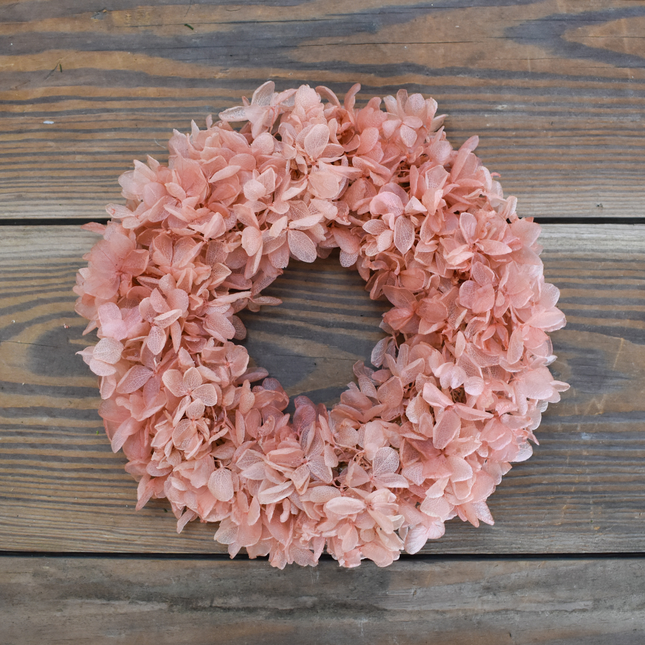
Even in our spring collection, we have a coral-colored wreath to brighten up your home. Check out our Preserved Hydrangea Ring 6.5"! Spring will be here before you know it.
Whether you call it salmon, peach, coral, or apricot, the 2019 Pantone is sure to spark joy in your home in the upcoming year with its fresh-out-of-the-ocean vibe. The new Pantone each year really does set the tone for some many industries, including ours! Where do you see Living Coral in your home?
______________________
On a separate note, we would like to thank all of our readers in 2018 for your support of our blog! In 2019, we have many more great posts coming your way.
We would like to wish all of you a Happy Holiday and a joyful New Year, from all of us at Mills Floral Company!

______________________
Sources:
-
https://www.pantone.com/color-intelligence/color-o...
-
https://www.brit.co/ikea-home-decor-pantone-living...
-
https://www.vogue.com/article/pantone-color-of-the...
Please follow us on social media!

